5 of the most striking home exteriors

Who knew that a homeowner’s decision to repaint the front door of a house overlooking the street could stir up opprobrium among residents or councils, as was reported last week? After all, front doors painted different shades are a common enough sight in cities, and often welcomed for being characterful and enlivening predominantly grey or neutral urban environments. They might be eye-catching but they don’t usually dominate a house’s façade.
More like this:
– The most ingenious recycled homes
– Inside Japan’s most minimalist homes
– Eight ways plants can improve your home
In some cities, councils apply strict rules to how colour is used on its heritage architecture, as Miranda Dickson discovered when she plumped for a pink front door for her new home in Edinburgh’s New Town. After receiving an anonymous complaint about it, City of Edinburgh Council ordered her to change its colour, having ruled that the “bright pink” door, as it dubbed the colour, was not “in keeping with the historic character” of the listed building. After contesting but failing to overturn the enforcement notice, Ms Dickson repainted the door green.
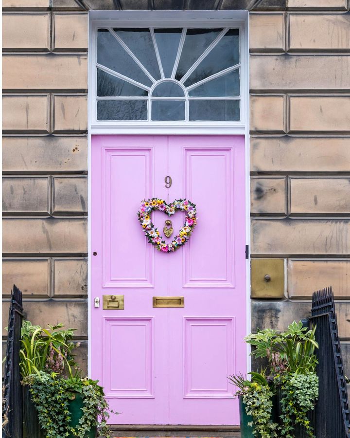
Miranda Dickson painted the front door of her Edinburgh house pink but was told by the authorities this was unacceptable (Credit: Alamy)
Much of New Town’s elegant Neoclassical architecture is intact, including the Robert Adam-designed Charlotte Square, and the area is a Unesco World Heritage site, so in one sense the council’s verdict isn’t surprising. Yet the colour Dickson chose to repaint the door – an acceptable spearmint shade – looks zingier than the pink she originally chose. A chief planning officer told her that she needed to stick to a prescribed set of more sober colours, such as dark red, dark grey, sage green, dark blue or black. Yet, armed with a camera, she snapped several local front doors painted with colours that were anything but muted, from fire-engine red to delphinium blue.
Far more challenging are houses whose entire facades are either radically experimental or distinctly unconventional. Take the house in London’s Kensington that was decorated in huge candy stripes. Or there’s The Blue House in Hackney, East London, which is entirely clad in baby-blue clapboard. Another example is architect Amir Taha’s project 15 Clerkenwell Close, which features an idiosyncratic façade of roughly hewn limestone encrusted with fossils. Taha won a protracted battle with Islington Council which initially ordered its demolition, having claimed that planning permission had originally been granted for a brick exterior.
By comparison, choices of colour for a front door in urban neighbourhoods might seem inconsequential but they throw up a multitude of issues, including satisfying a desire to conform to existing, reassuringly familiar regulations and traditions, to rebelling – or attempting to rebel – against them.
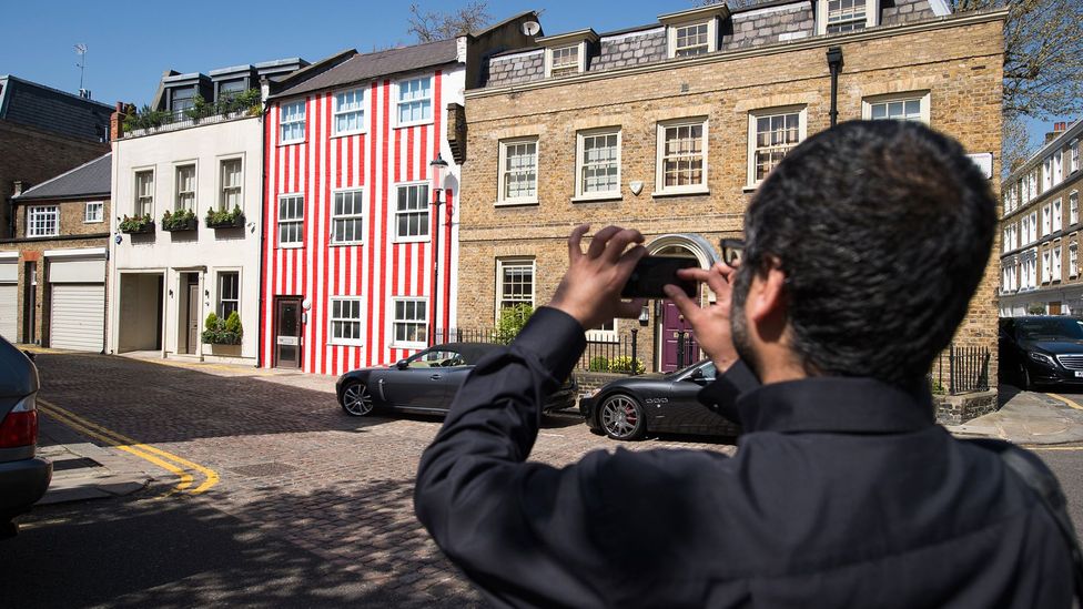
A homeowner in Kensington, London, chose candy stripes for her house front – it proved to be a divisive look (Credit: Getty Images)
The colours of front doors, window frames, shutters and other features on a house’s façade seen from the street inevitably make a very public statement about the personality, taste and status of a house’s occupants. Some might see these external features as an opportunity for self-expression, a chance to be creative, while others do so less consciously by accepting local customs and social expectations.
But conformity and rebellion in this context aren’t necessarily antithetical. Conformity occurs in certain neighbourhoods, too, where certain colours come to be widely favoured and almost automatically adopted. While this differentiates neighbourhoods, helps to define their character and makes residents feel like members of a club, it nevertheless represents a sense of tribal conformity in itself. Some neighbourhoods are known for embracing individualism and self-expression, giving residents comparatively greater leeway when choosing colours. A neighbourhood allowing for relatively more freedom when it comes to decorating a home’s exterior might come with its own pressure to conform but in reality it will attract like-minded people.
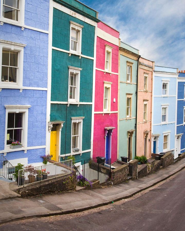
House facades in Clftonwood and other neighbourhoods of Bristol, UK, are famously painted in ice-cream colours (Credit: Alamy)
“In general, most people want to live in areas with like-minded people,” says Justine Fox, a colour design expert and founder of Studio Justine Fox. Famous examples of polychrome rows of terraces can be found in Notting Hill Gate and Kentish Town in London, Cliftonwood and other areas of Bristol, New Quay in West Wales and Broadstairs in Kent. However, some neighbourhoods that appear to welcome a broad spectrum of colours tend to limit these to pretty, cheerful and conventionally picturesque ones. “Even in areas where a lot of colour is welcomed, there’s a certain conformity in the types of colours used and deemed tasteful,” says Fox.
The perfect palette
Adhering to established, inflexible colour palettes in urban communities, however wide the choice of colours permitted, doesn’t benefit residents: “Many cities, particularly European ones such as Stockholm and Turin, have clearly defined colour plans to preserve their cultural identity but these don’t really represent or address changing demographics or societal needs. I think there’s always this tension between traditionalists and futurists.”
Traditions in favoured palettes vary from one city or even continent to another, Fox elaborates. “Cool floral pastels and seaside blues are often the norm in the UK, while in Mexican towns and cities you often encounter flaming oranges, yellows, reds and pinks.” The external walls of Mexican modernist architect Luis Barragan’s house Casa Gilardi combine hot pink and a lavender shade inspired by a jacaranda tree on the site. His style went on to influence many Mexican architects, including his protégé Ricardo Legorreta.
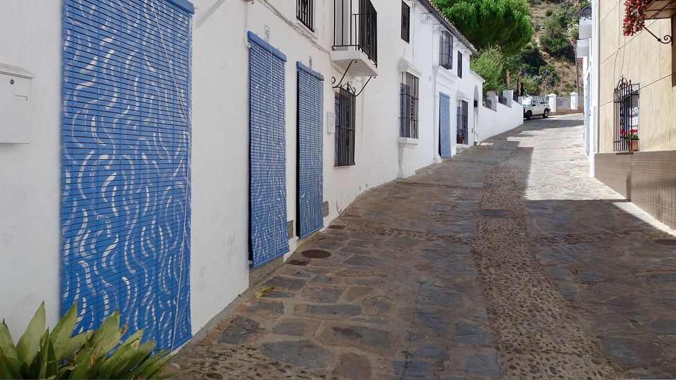
The artist José Medina Galeote painted façades in Genalguacil, Malaga after consulting with the local community (Credit: José Medina Galeote)
Some communities embrace change, reflecting a more liberal, adventurous outlook. In Andalucia, southern Spain, Genalguacil, one of the region’s all-white villages so prized by tourists, regularly invites artists to create architectural interventions, thereby demonstrating a higher regard for contemporary culture over tradition. A pragmatic need to halt the number of people leaving the village – an economic malaise plaguing much of Southern Spain – led to the creation in 1994 of the Genalguacil Pueblo Museo project, which sees artists creating public art interventions. Doubling as a regeneration project, it has resulted in the village’s population growing by 4% every year since 2019. One artist, José Medina Galeote, has painted doors and blinds of private houses in feelgood sky blues with dynamic white gestural marks that enliven the city streets, without such interventions being regarded as sullying the purity of the village’s all-white architecture. On his Instagram page, Galeote states that several local inhabitants enthusiastically cooperate with him every year.
A more extreme transformation of a white-washed Spanish village took place in 2011, when the walls of all houses in Júzcar, near Malaga, were painted cerulean blue as the location for the movie, the Smurfs. Smurf characters also popped up everywhere, erected as public statues or daubed on huge murals. With tourists suddenly flocking to Júzcar in droves, the village kept the homogeneous blue colour scheme that had provided a much-needed economic lifeline. However, an argument in 2017 between the locals and the Smurf powers-that-be means that Júzcar’s streets have since been denuded of recognisable Smurf references.
Reflecting on the recent dispute in Edinburgh of the pink versus the green door, Fox says: “In this case the aversion and labelling of it being a ‘bright’ pink is down to its tint being cool and clear, appearing more reflective and so more visible.” She also believes that choices about colours of doors should also factor in a consideration for neighbours. “As this is a door, the integrity of the original facade hasn’t been compromised but I think that when we’re planning external colours, there should be some respect for the right to peaceful enjoyment of an area by neighbours. I’m not advocating homogenisation, just a little respect for the character of an area and others living there.”
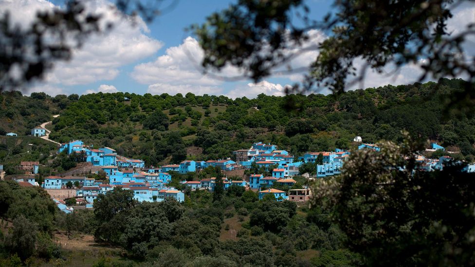
Controversially, the village of Júzcar in Spain was painted blue to promote a Smurfs movie (Credit: Getty Images)
An almost insoluble heritage versus self-expression debate lies at the heart of this issue, it seems. There are valid arguments for and against both viewpoints. Robin Dhar, director of Donald Insall Associates, cites London’s Belgravia as an example of a neighbourhood whose architecture was conceived as a “whole composition”, such that altering it would destroy its integrity. “All rendered buildings should be painted in the same colour because the original objective of Belgrave and Eaton Square was that each side reads as a grand palace, despite the fact that each side of the square now comprises individual houses or apartments. In this case, each element must be considered as part of a whole scheme.” But he qualifies this by adding that a degree of variety was reserved for neighbouring mews houses.
Meanwhile, interior designer Rachel Forster firmly believes in greater freedom when it comes to using colour on the facades of homes. “I grew up with a poster on my kitchen wall of front doors in Dublin painted in a multitude of colours and have always enjoyed the variety of colours people choose for their front doors. Paint is a wonderfully cheap way of adding personality to any project and the front door is the portal to individual’s lives. During lockdowns, people made changes to their homes inside and out as it was the one thing they could control. A client of mine who owned a Spanish restaurant in East London chose pink for her facade. It lit up the street and set the tone for her business, which was bustling and friendly. The local council requested she change to a muted colour to fit in with the neighbouring buildings. I find this to be a shame. As a strong advocate of colour, I believe we should be allowed to paint our homes and businesses as we choose. Bold colours brighten up the world, provide landmarks and spark conversations.”
If you would like to comment on this story or anything else you have seen on BBC Culture, head over to our Facebook page or message us on Twitter.
And if you liked this story, sign up for the weekly bbc.com features newsletter, called The Essential List. A handpicked selection of stories from BBC Future, Culture, Worklife and Travel, delivered to your inbox every Friday.


